Harmonizing heritage and hospitality
The Tsetsu
Challenge
The Tsetsu Hotel, a native-owned boutique hotel, needed a brand identity that promotes awareness of Coast Salish culture and values, attracts guests seeking to reconnect with themselves and their surroundings, and increases bookings. The cultural and spiritual values associated with the name of the hotel, Tsetsu, derived from the Coast Salish phrase "tsetsuwatil"—working together for the common benefit—needed to be captured in the design of the identity.
Approach
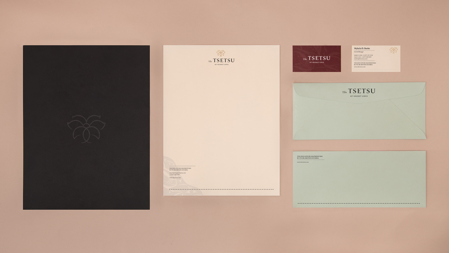
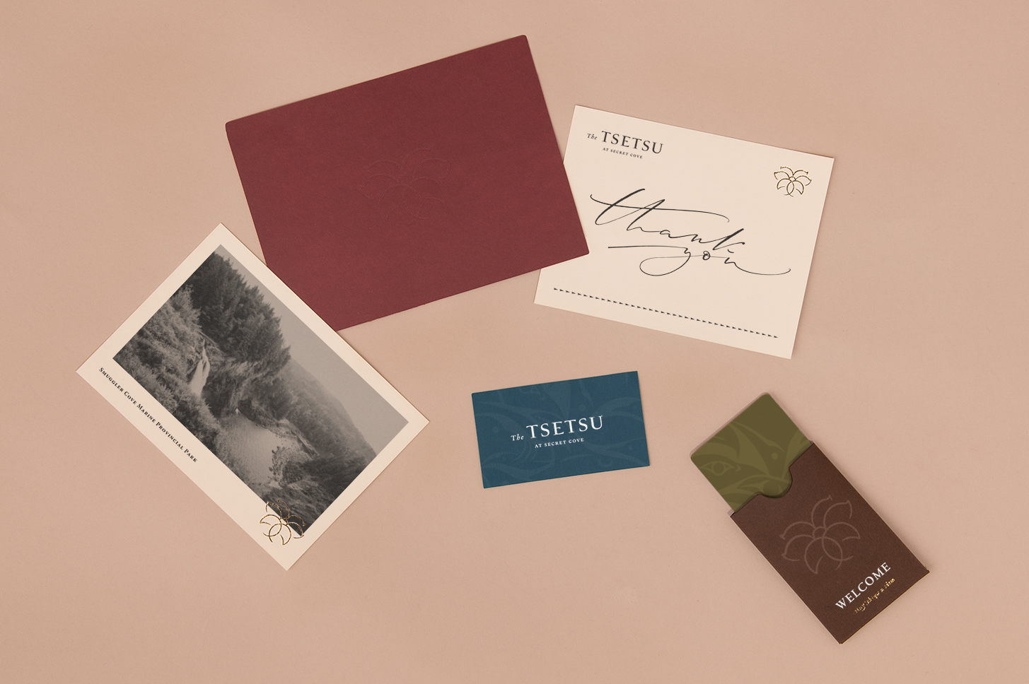
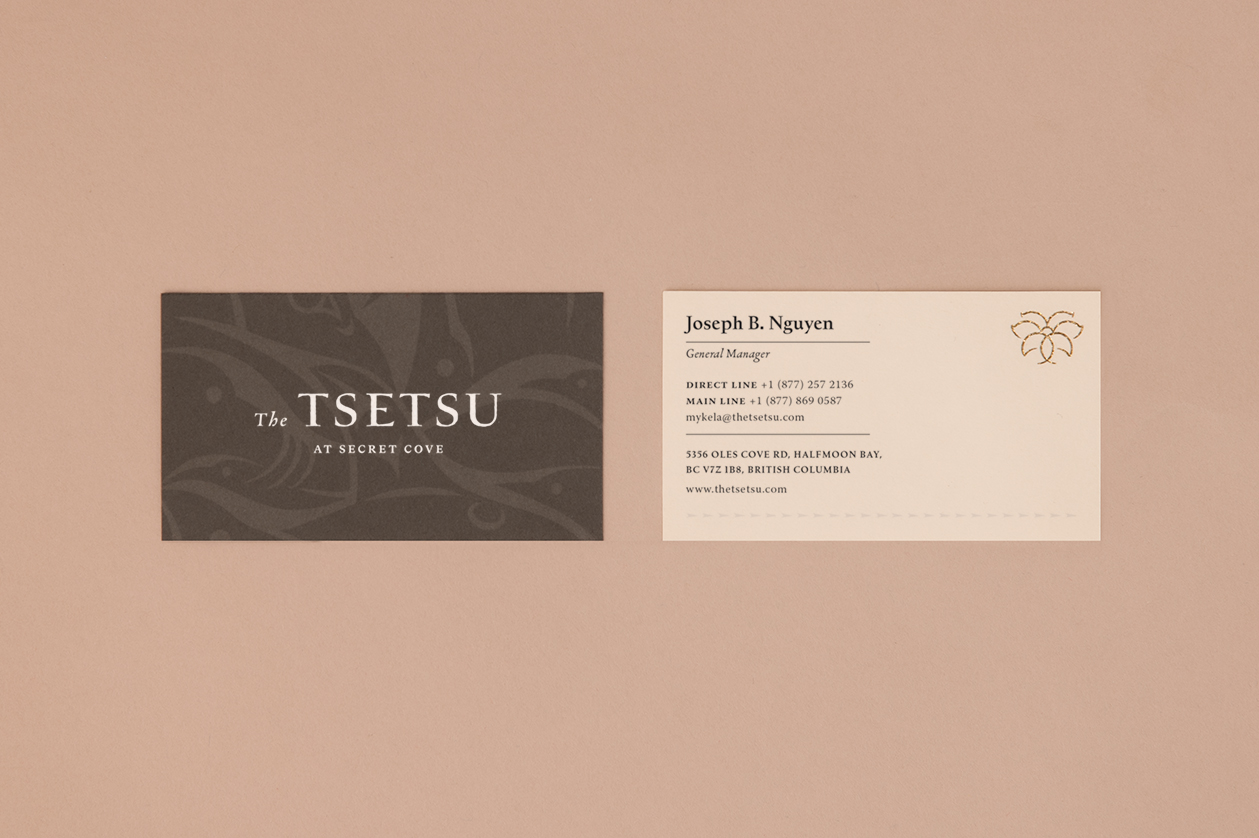
To authentically embody the essence of Tsetsu Hotel's brand identity, the design process delved into the inspiration behind the hotel's name and the vibrant Coast Salish culture. Drawing from the enchanting surroundings of Vancouver, the symbol chosen to represent the hotel was the Camas Lily Bulb, epitomizing a deep-rooted harmony and profound connection with nature. Extensive research into historical Coast Salish documents from the 1800s led to the creation of a logotype that gracefully captures the rich typographic heritage. The color palette was thoughtfully curated to evoke the serene allure of natural elements, seamlessly intertwining with the symbolism of the Camas Lily Bulb. In a remarkable collaboration, esteemed local Coast Salish artist Susan Point was commissioned to craft a captivating array of illustrations, infusing the brand identity with captivating depth. The ultimate goal was to not only enhance bookings but also cultivate a profound appreciation for Coast Salish culture and its intrinsic values.
Services
Brand Identity
Brand Strategy
Stationery
Web Design
Naming
Personality
Ancestral
Harmony
Community
Fonts in use
Kernevel
Warnock Pro
Completed
Spring 2023