Aligning with the mission
Oncology and Kids
Challenge
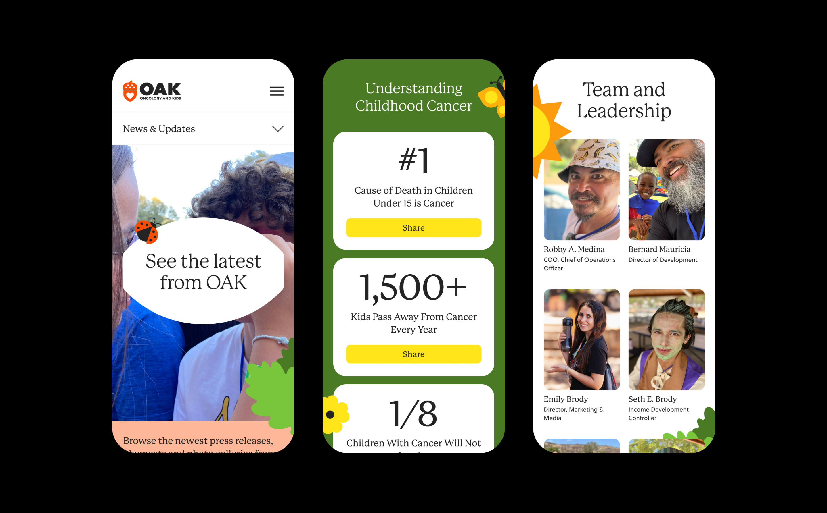
The nonprofit, Oncology and Kids (OAK), faced a pressing challenge in effectively communicating its core values and mission through its existing website. The current layout, color scheme, typography, and photography fell short of capturing OAK's sense of community; potentially impeding its ability to reach and assist more families affected by cancer. By creating a visually appealing, mission-driven, user-friendly website experience, OAK aimed to strengthen its impact and forge stronger connections within the community they serve.
Approach
To effectively align OAK's website with its mission, the brand's expressive, geometric logo inspired the creation of visually engaging illustrations, evoking the charm and nostalgia of children's craft-paper art. A free-spirited serif font, P22 Mackinac, was strategically selected to strike a balance between approachability and credibility. Inspired by OAK's commitment to providing outdoor experiences for children, a vibrant and nature-inspired color palette was meticulously curated, adding a touch of energy and harmony to the website. To further accentuate the sense of community, heartfelt brand photography was thoughtfully incorporated. In addition to the visuals, a thorough reorganization of the website structure took place, resulting in improved intuitiveness and user-friendliness. This strategic adjustment ensures that new users can readily grasp OAK's mission and easily navigate the website to discover the valuable services provided to families affected by cancer.
Services
Website Design
Content Strategy
Illustration
Personality
Awareness
Belonging
Playfulness
Vision
Fonts in use
P22 Mackinac Pro
Soleil
completed
Spring 2023
.jpg)


